
Helping a sky diving team reach new heights with a bold new identity.
Nova is an amateur freestyle skydiving team competing at a world class level. With the team competing at ever higher levels a visual mark that would look brilliant both online and on their kit as they fell through the sky was a no brainer.
Client: Nova

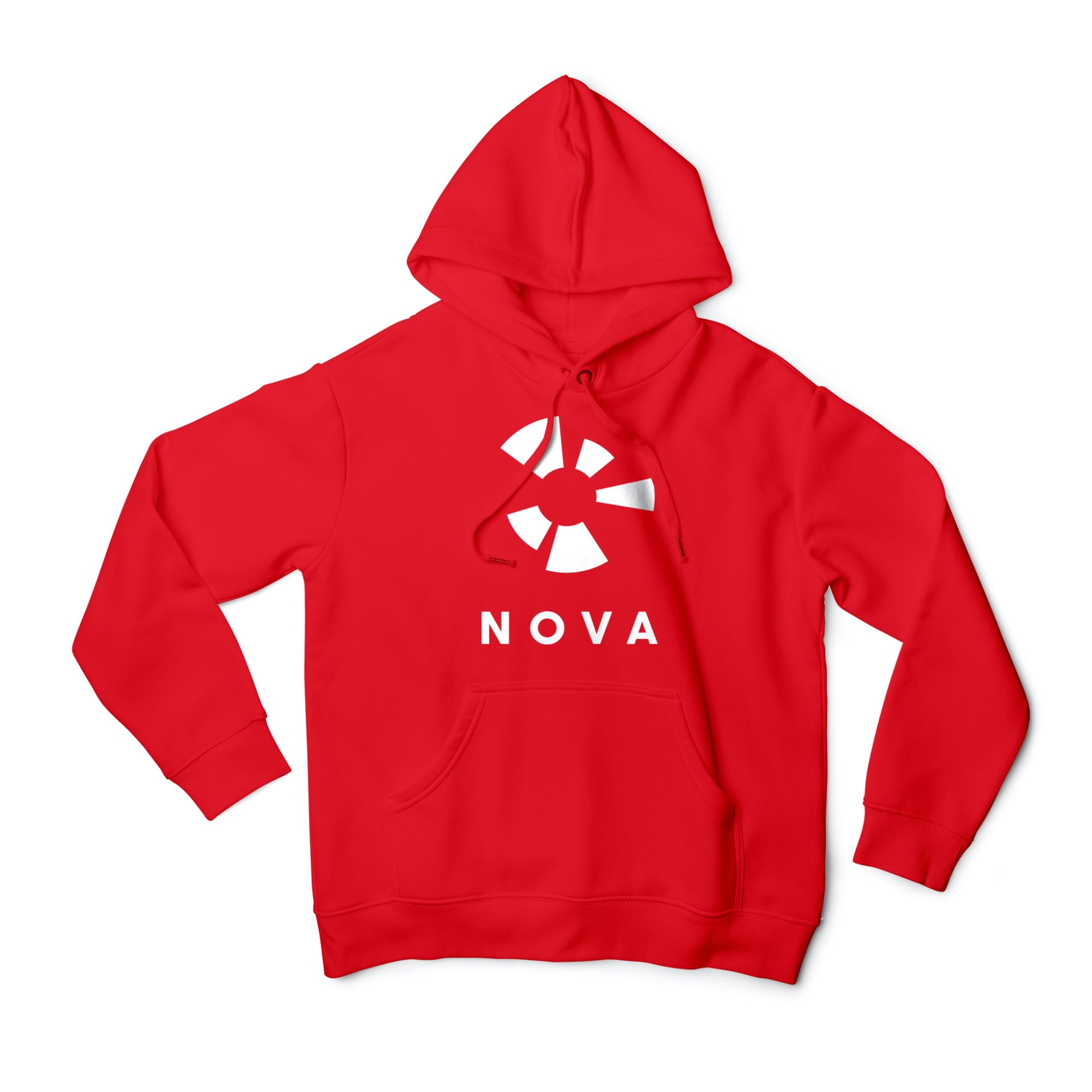
As the identity needed to be embroidered and be recognisable at a distance, a minimal ident worked best with subtle nods to the parachutes and human form worked into the mark.

Since the new look was brought in, the team have continued to soar (sorry) taking the gold in the BPA Freestyle Nationals 2019.
We wanted something striking and simple that would work well across a broad range of mediums — be that print, web, and even embroidery! Because it really does work on everything we put it on.
Chris Mayhew
Nova