Branding, Identity, Print design, Web design
A brand identity for a new digital studio with an ethical focus and academic credentials.
Dr Kim Foale needed a look which captured the essence of both them as a personal brand, and their mission. Their academic background and ethical focus meant it didn’t want to be too dry and dusty or unapproachable.
Having worked with Kim for several years it was great to get to grips with creating the brand for them and help them create the visual identity which struck the right balance between their academic background and ethical mission, with a pleasing dash of nerdiness thrown in.
Client: Geeks for Social Change
Web development: Geeks for Social Change
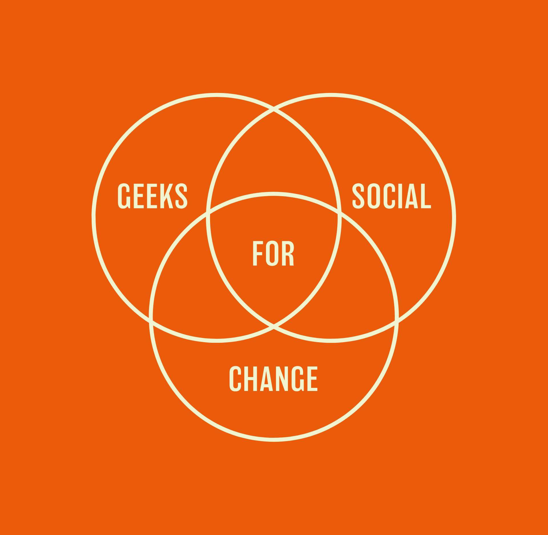
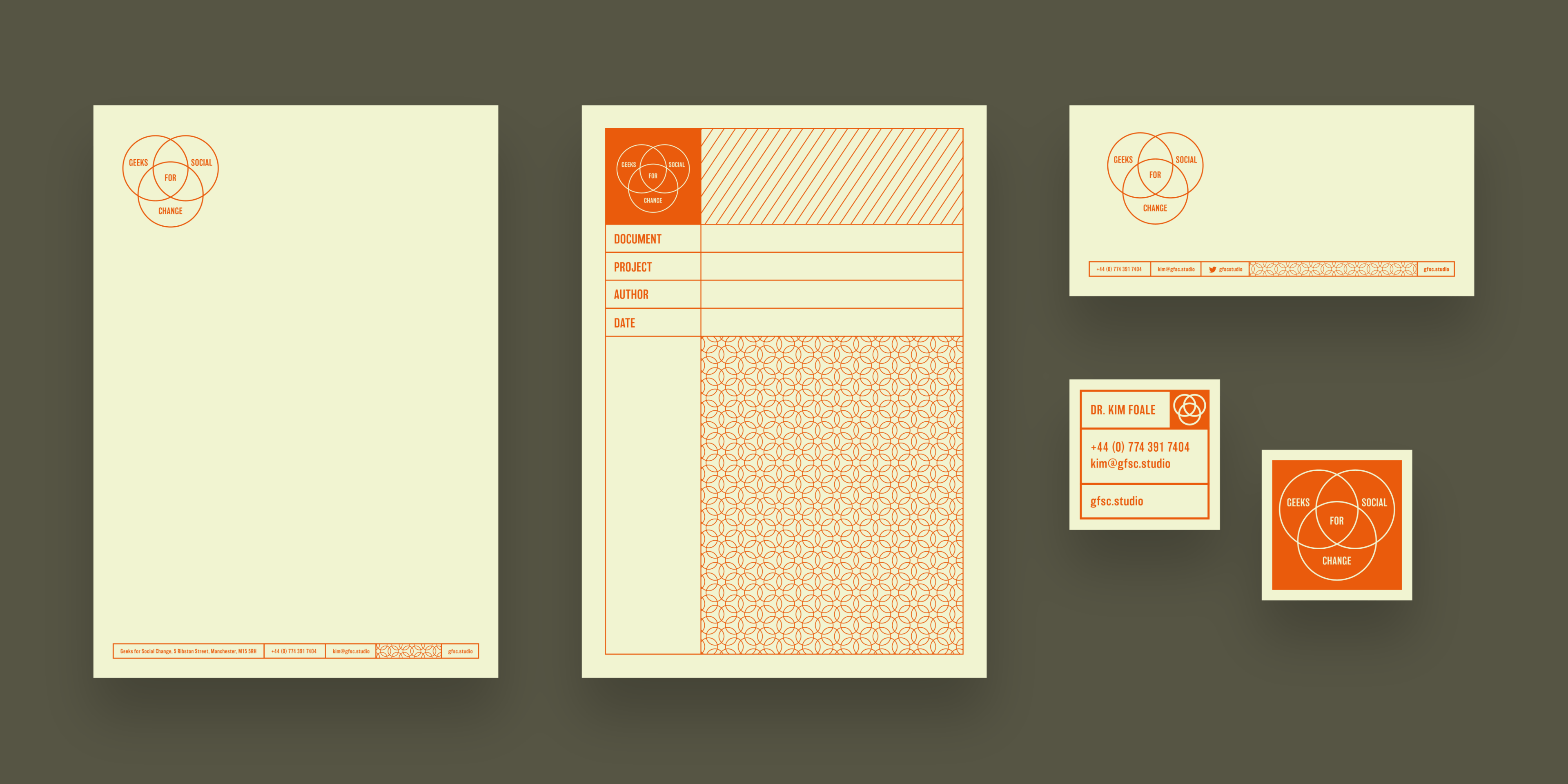
We quickly decided to go towards a retro aesthetic, which appealed to Kim’s love of data and planning charts — and found ourselves exploring the classic Venn diagram which fitted like a glove.
We rolled heavily into this and embraced a cheerfully geeky aesthetic, utilising lots of forms, frames and exercise book patterns with a confident vintage colour palette we established a welcoming and friendly vibe which works well online and off.
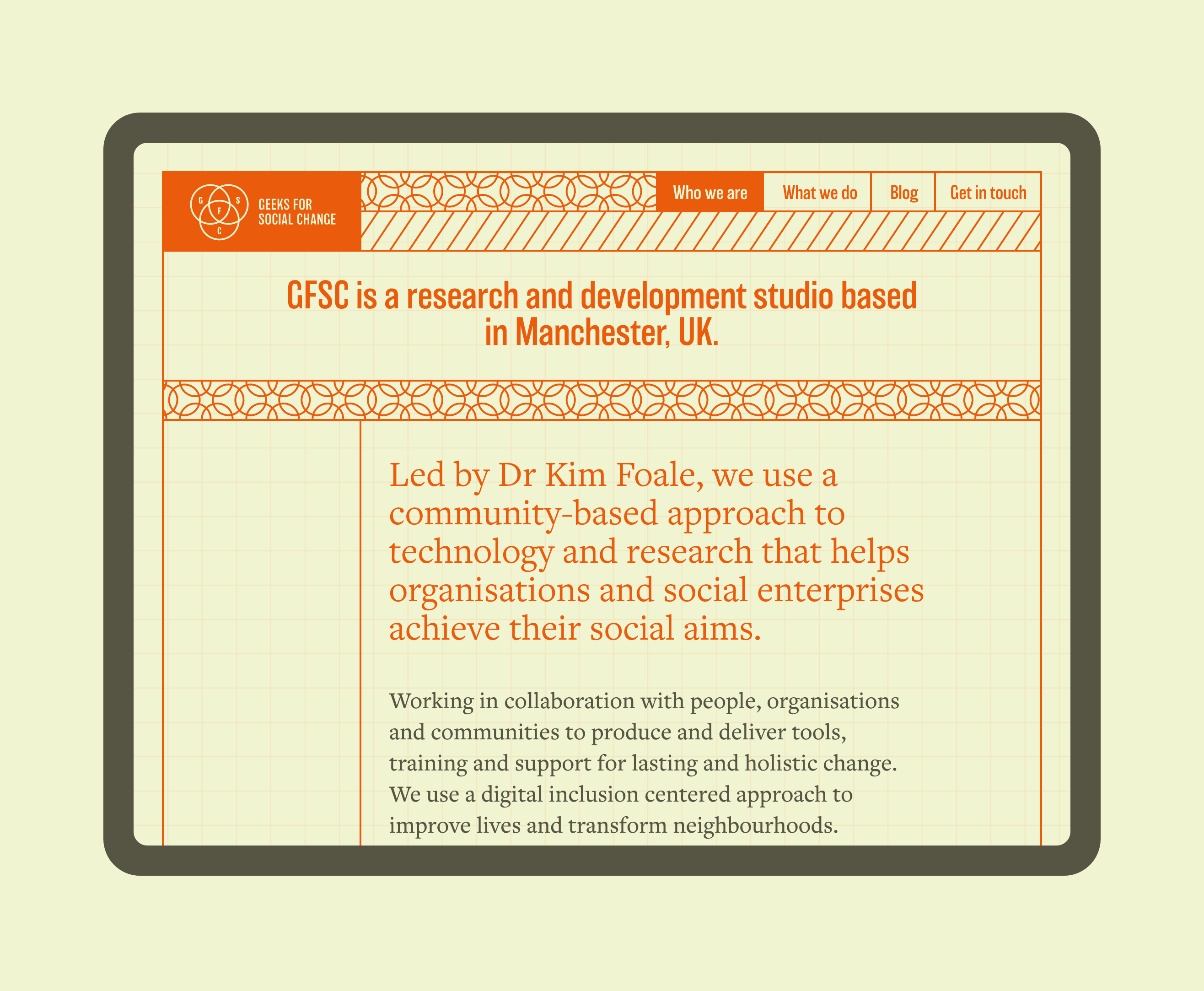
For the web, this retro vibe continued, with nods to old versions of operating systems from the past here and there.
Mark has been my first choice designer since working with him on a volunteer project in 2015. I’ve since commissioned him for a number of web-based projects of different scales, from grassroots community groups to highly polished “software as a service” packages.


Mark always brings something wonderful and often unexpected to these projects that simply gives them another dimension. He produces not just world class designs, but consistent advocacy for simplicity and clarity of communication that goes way beyond a design brief. He makes sure his creative vision gets realised even in complex projects with lots of people involved. Every project he’s involved in gets overwhelming positive feedback for the design, which would not be possible without this holistic and considered approach. I don’t hesitate to recommend him for projects of all sizes that draw in the audience and keep them close.
Dr Kim Foale
Geeks for Social Change