
Branding, Identity, Illustration, Print design, Web design
An age friendly look for an ambitious calendar.
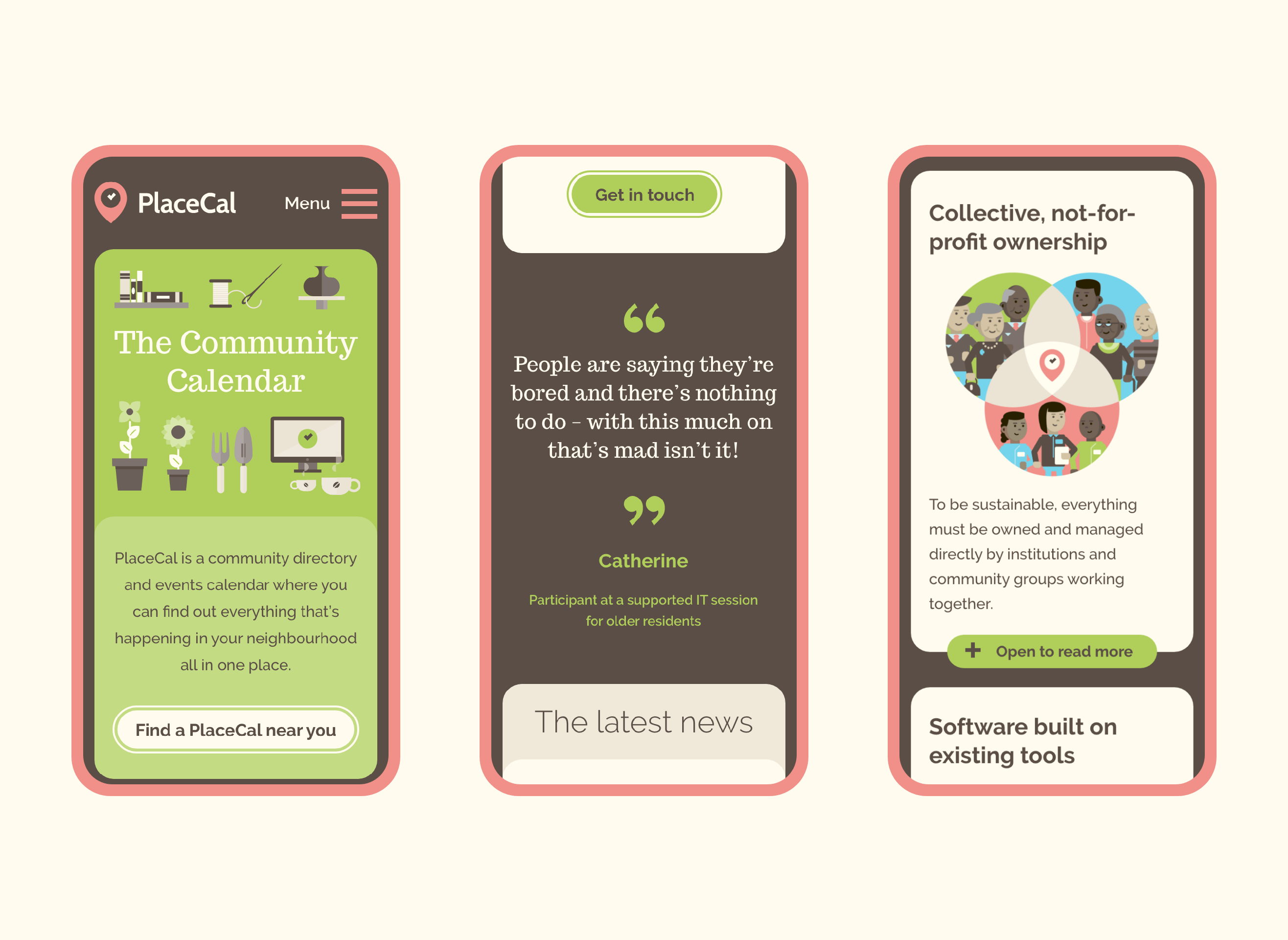
PlaceCal is a community calendar with the aim of reducing social isolation and positively affecting local neighbourhoods.
It came about as a result of age friendly research done by Phase at MMU which discovered there was a widespread misconception that there was nothing to do in the local area. PlaceCal aims to address that by enabling communities to connect and to discover what’s on.
Communicating all that however was proving difficult — an academic approach to a social situation needed a clear and friendly look to help folks connect and welcome a new tool and approach.
Client: Geeks for Social Change
Web Development: Geeks for Social Change
Working closely with Geeks for Social Change and Phase, we established a warm vibrant look which was both highly legible and engaging along with an identity and strapline which helped communicate quickly exactly what PlaceCal was all about.

We struck a careful balance with the overall brand which was not too retro, but used a warm soft vintage palette, with very clear and bold open source typefaces which could be used online and off with ease.

Alongside the branding Squid has been responsible for a lot of illustration to explain the process of PlaceCal and the reasons for PlaceCal and how it addresses known issues.


Since the initial branding, Squid has remained closely involved, producing many pieces of print and illustrations to support the original pilot scheme of PlaceCal and beyond as it rolls out to new areas around the UK.


PlaceCal has gone on to win the AAL Smart Ageing Prize 2018 and was a finalist in the Nesta Tech to Connect Prize 2019 and is continuing to expand across the UK.
Squid created a strong visual identity for PlaceCal, gave excellent advice on both print and online comms and on how to get the most out of our budget. It was a pleasure working with them. We won’t hesitate to use them again.
Professor Stefan White
Manchester School of Architecture