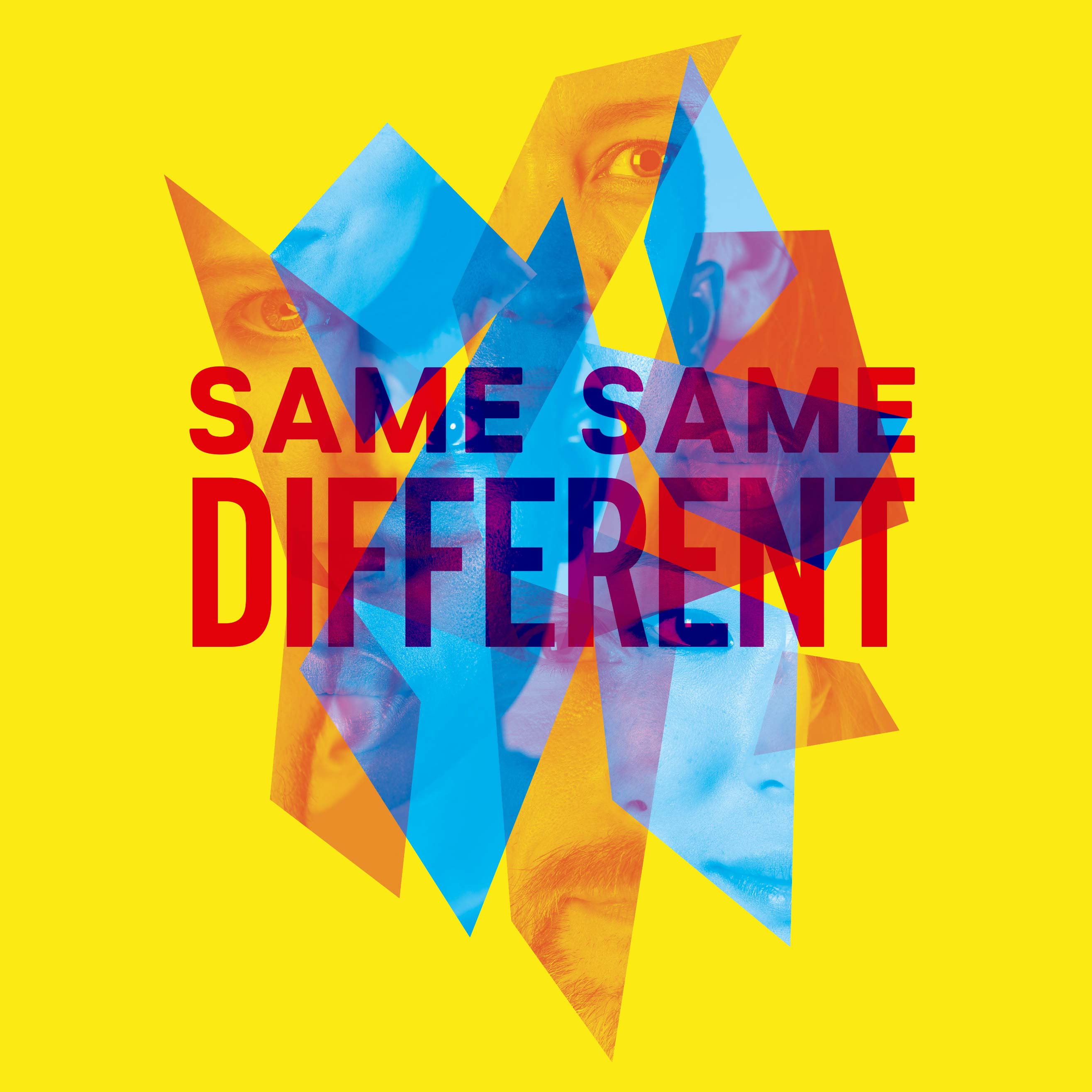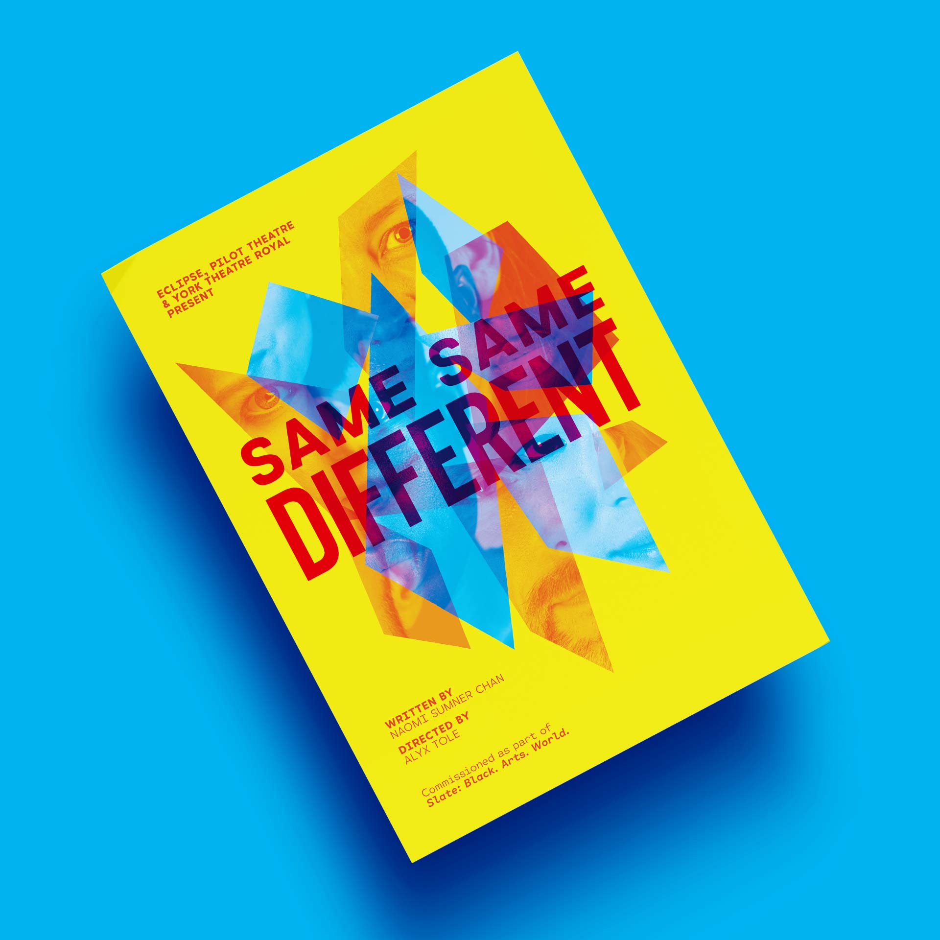
An arresting and playful look for a theatre performance examining the identity of transracial adoptees.
Naomi Sumner Chan, the writer behind SAME SAME DIFFERENT wanted a look which grabbed you and connected instantly to the subject matter — the fragmented sense of identity a transracial adoptee can have.
The performance is a verbatim play that takes a blunt but playful look at the lives of adoptees throughout the world, and isn’t afraid to ask questions that most of us wouldn’t dare about adoption — delivered in an irreverent and self aware fashion.
Client: Brush Stroke Order
Photographer: Michael Townsend

The shattered mirror — seeing yourself reflected, but different to those around you came up very early on — and the photography of the cast offered a great way to form something beautiful but messy and attention grabbing.

We brought the whole thing to life with some brash and blunt typography which tied in well with the spirit of the play across all the materials during the production.

Mark created a brilliant eye-catching design for the SAME SAME DIFFERENT posters, flyers and online branding. The bright colours of our printed programmes stood out in theatre foyers which was ideal, drawing attention to the work of a new playwright and the image of fractured reflections on shards of glass fitted the themes of the play. We loved his work so much that we incorporated elements of his design into the set and costumes.
Naomi Sumner Chan
Brush Stroke Order