Branding, Identity, Print design, Web design
Creating a modern look for an old art form.
A brand new venture, created by Aamir Rafi and Kim Foale, Tai Chi School is an online educational resource teaching Tai Chi through tutorial videos online — opening up high quality teaching at home.
Competitors tended to share a very busy and dated aesthetic which Tai Chi School were keen to avoid.
Client: Tai Chi School
Web development: Geeks for Social Change
Despite the desire to set apart from other Tai Chi practitioners, it was decided very early on that the yin and yang symbol must be part of the overall look.
The result was an identity which embraced a very striking and minimal take on the symbol – still recognisable but very much able to be part of Tai Chi School’s own pared back look.

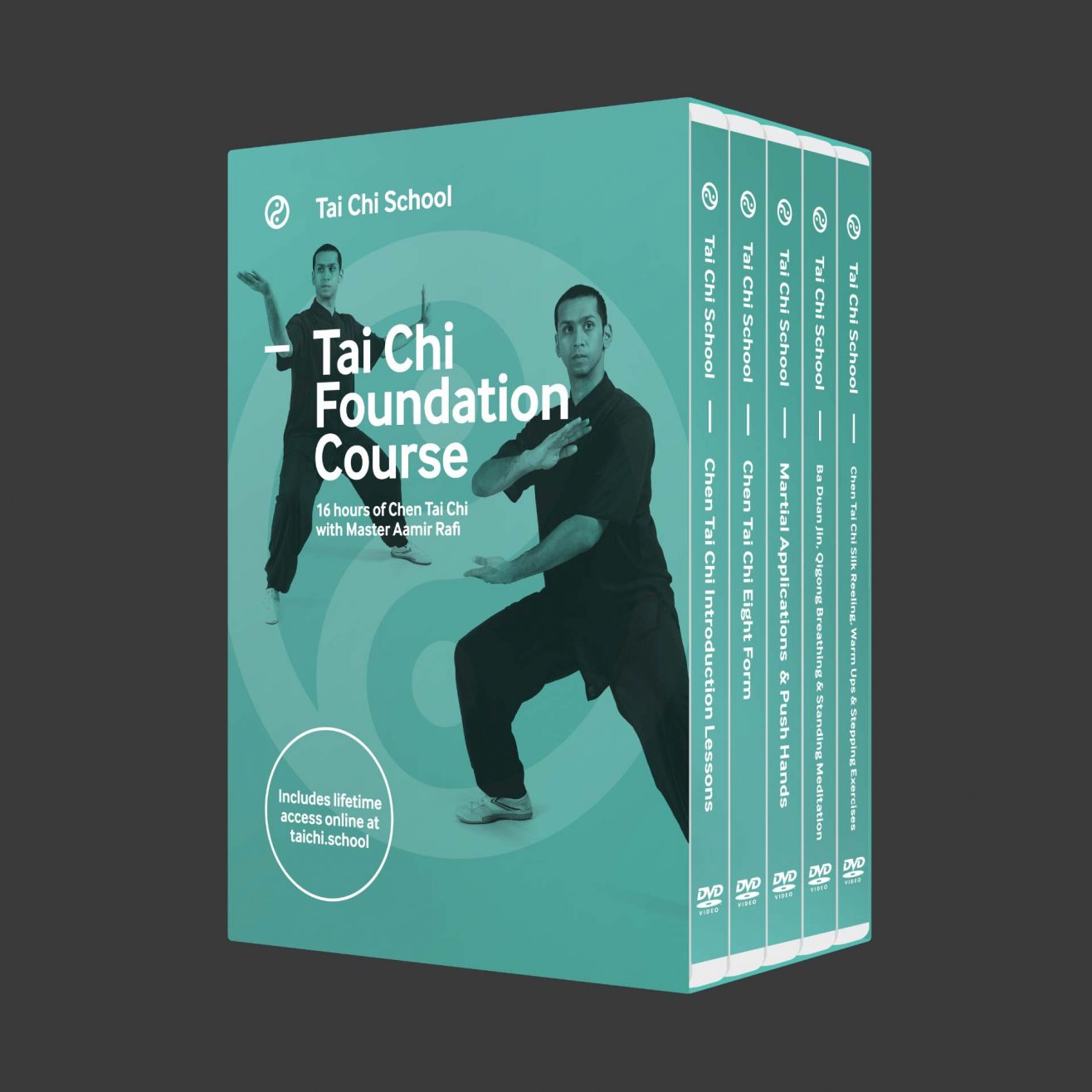
The visual identity for the brand was designed to make the most of their photography and highlight the tutor and Tai Chi expert Aamir, whilst making clear this was a modern and confident brand.
Since the initial branding Squid has gone on to produce DVD packaging and interfaces for the business along with several iterations of the website.


I set up Tai Chi School with Mark’s help in 2016. Mark was very easy to work with, he listened closely to my vision for the business and helped clarify my objectives and deliver a great brand and successful website. His continued support with print and updates to the website has been very positive, and I would recommend him to anyone.
Master Aamir Rafi
Tai Chi School


